Chart components
Chart nodes have purple title bars and live under + Visual. They all take a dataset, most take a filter and a marking, and they all report a selection.
Common ground
Fields, on the node
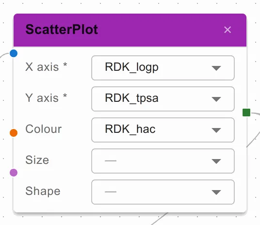
Each chart’s fields are chosen on its node in the Design tab. Only fields of a
suitable type are offered, and a field marked * is required.
Selecting
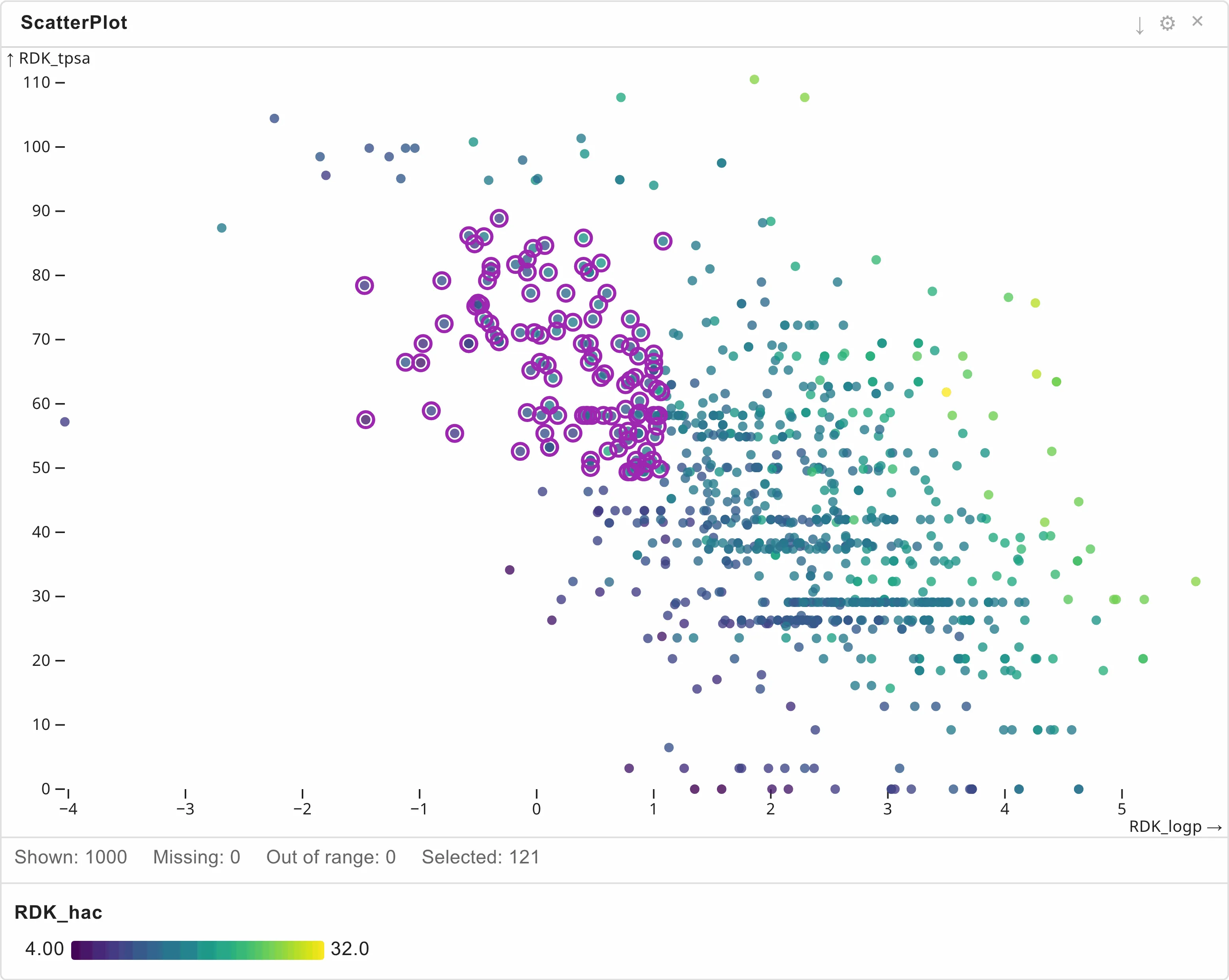
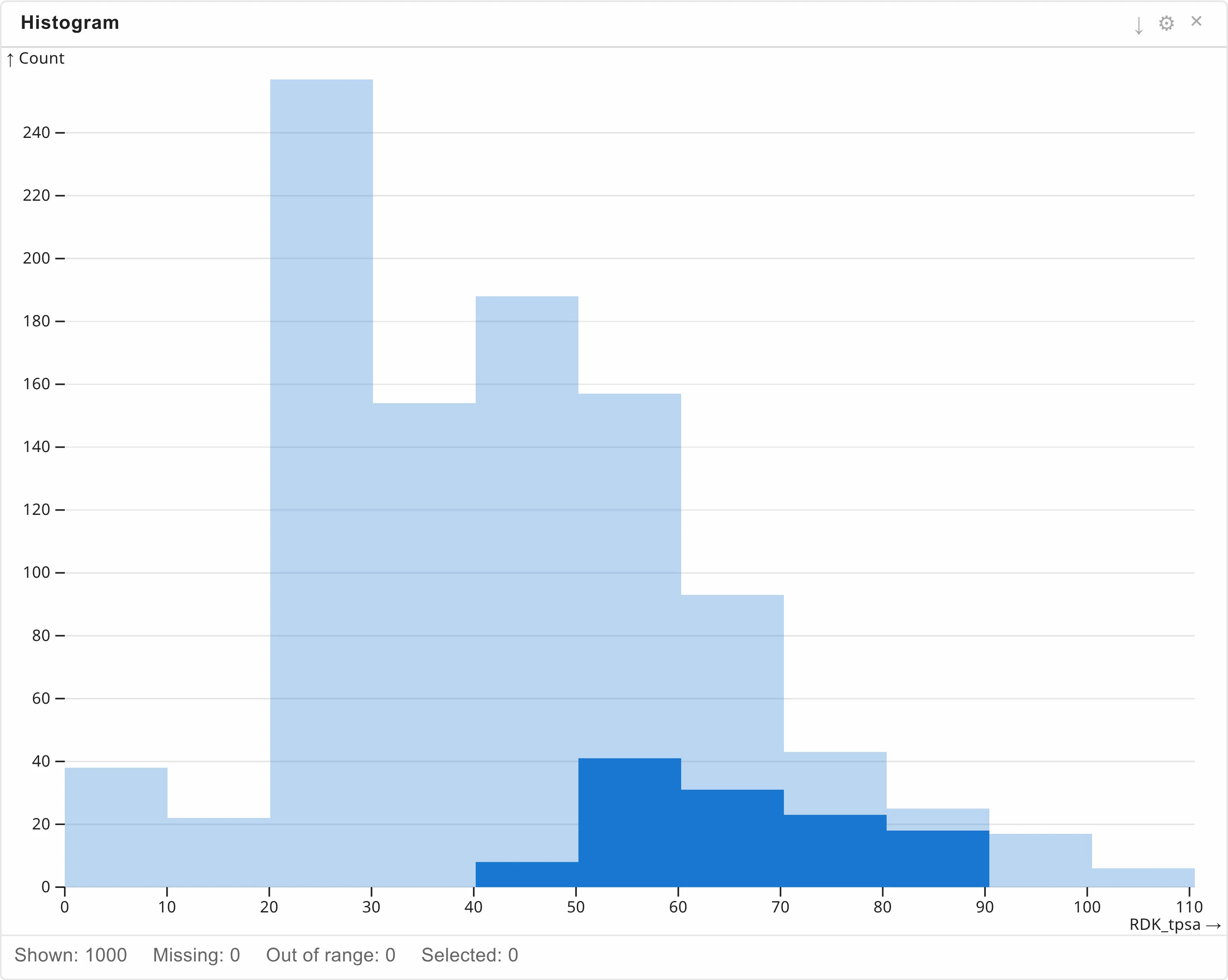
Drag a box over a chart to select what is inside it. The selection is drawn distinctly — rings around selected points in a scatter plot, a solid bar against a pale one in a histogram — and the Selected count in the status bar says how many rows it holds. Clicking empty space clears it.
Two charts select whole bins rather than individual rows, because that is what they draw: the Histogram outlines a whole bar holding a selected row, and the HexbinPlot outlines a whole hexagon. For a finer grain, use smaller bins.
Settings
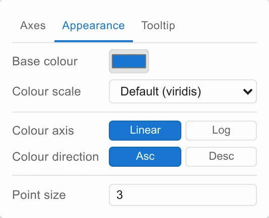
What applies to every component’s ⚙ — tabs, auto (…) placeholders, the
Tooltip tab, and the fact that settings belong to the view — is under
Settings. What the charts share on top of
that is below.
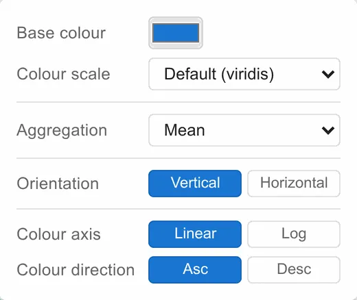
Base colour is what the chart draws in when no field is mapped to colour. Until you set one, the chart follows the application’s default colour; the ↺ beside it puts the chart back onto that default. Colour scale is the ramp used when a field is mapped to colour; Default (…) follows the application’s default colour scale, and names the one it currently is.
Wherever a numeric field is mapped to something visual — a colour, a size, an axis — two toggles follow it:
- Linear / Log — the scale. Log is for values spanning orders of magnitude, such as an IC50. It cannot show zero or negative values, and rows carrying them are counted as out of range.
- Asc / Desc — which end of the field counts as the top of the scale.
Aggregation appears on the three charts where several rows share one mark — the histogram, the integer scatter plot and parallel coordinates. It decides how their colour values are combined: Mean, or Geometric mean for a quantity that is naturally multiplicative.
ScatterPlot
X against Y, one point per row, with optional colour, size and shape fields. The workhorse.
Fields: X axis*, Y axis*, Colour, Size, Shape.
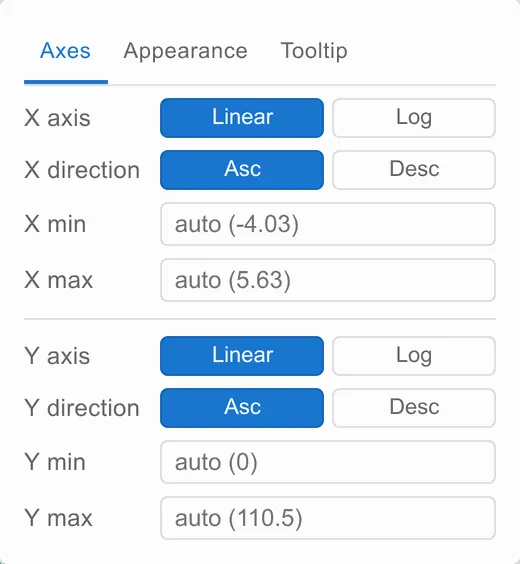
Axes | Appearance | Tooltip
| Tab | Settings |
|---|---|
| Axes | X and Y: scale type, direction, minimum, maximum |
| Appearance | Base colour, colour scale, colour scale type and direction, point size — plus size scale type and direction when a size field is mapped |
| Tooltip | The tooltip expression |
FacetScatterPlot
The same plot split into a grid of small multiples by two further fields — one choosing the row, one the column. Use it when a relationship might differ between groups: the grid shows all the groups at once, on shared axes, so the comparison is direct.
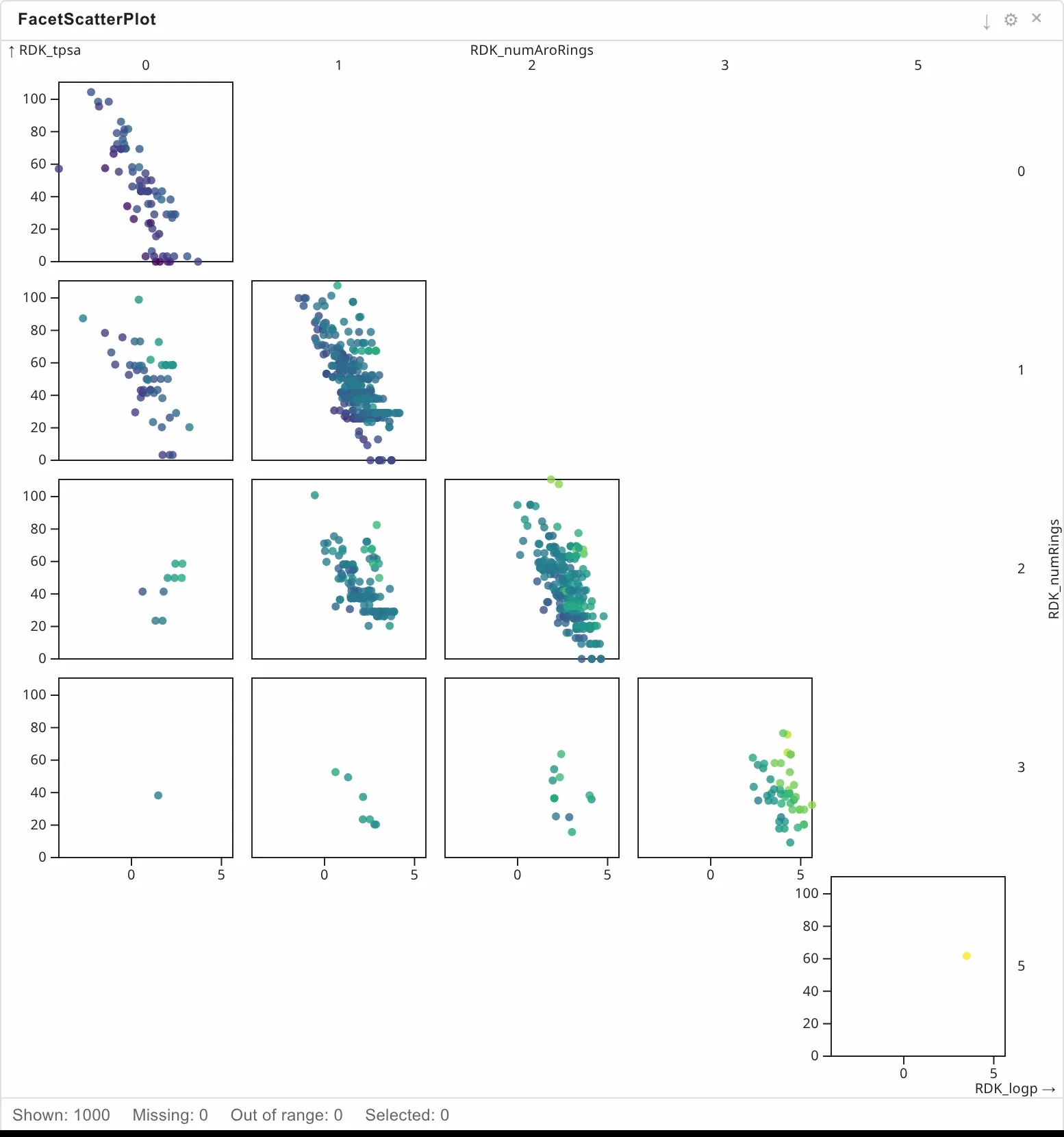
Fields: X axis*, Y axis*, Row facet*, Col facet*, Colour by.
Selection works per facet — drag a box inside one cell. It shares the ScatterPlot settings panel, minus the point-size and size-field rows.
MultiFieldScatterPlot
A grid of scatter plots, one for every combination of the X fields and the Y fields you choose. Dragging a box selects across all of them at once.
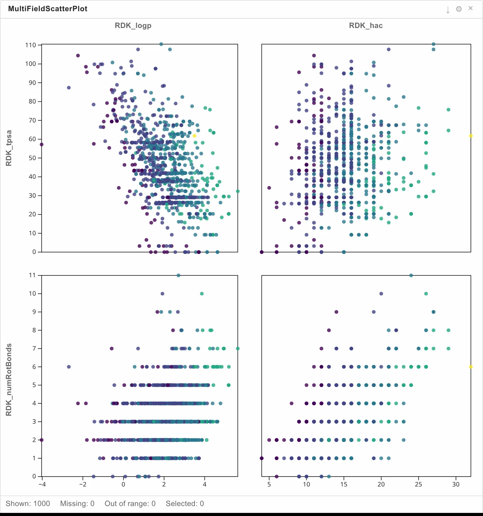
Fields: X fields* (two or more), Y fields* (two or more), Colour by.
Appearance | Tooltip
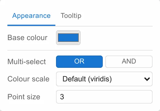
Multi-select decides how selections from several subplots combine: OR — union takes anything matched anywhere, AND — intersection only what every subplot agrees on. The rest of the tab is base colour, colour scale, point size and a shared minimum and maximum for X and Y.
With many independent axes on screen, this chart has no per-axis scale or direction controls.
IntegerScatterPlot
For fields with a handful of distinct whole-number values — ring count against rotatable bonds, say. Rows landing on the same pair are drawn as one circle, sized by how many, so an ordinary scatter plot’s overplotting problem disappears.
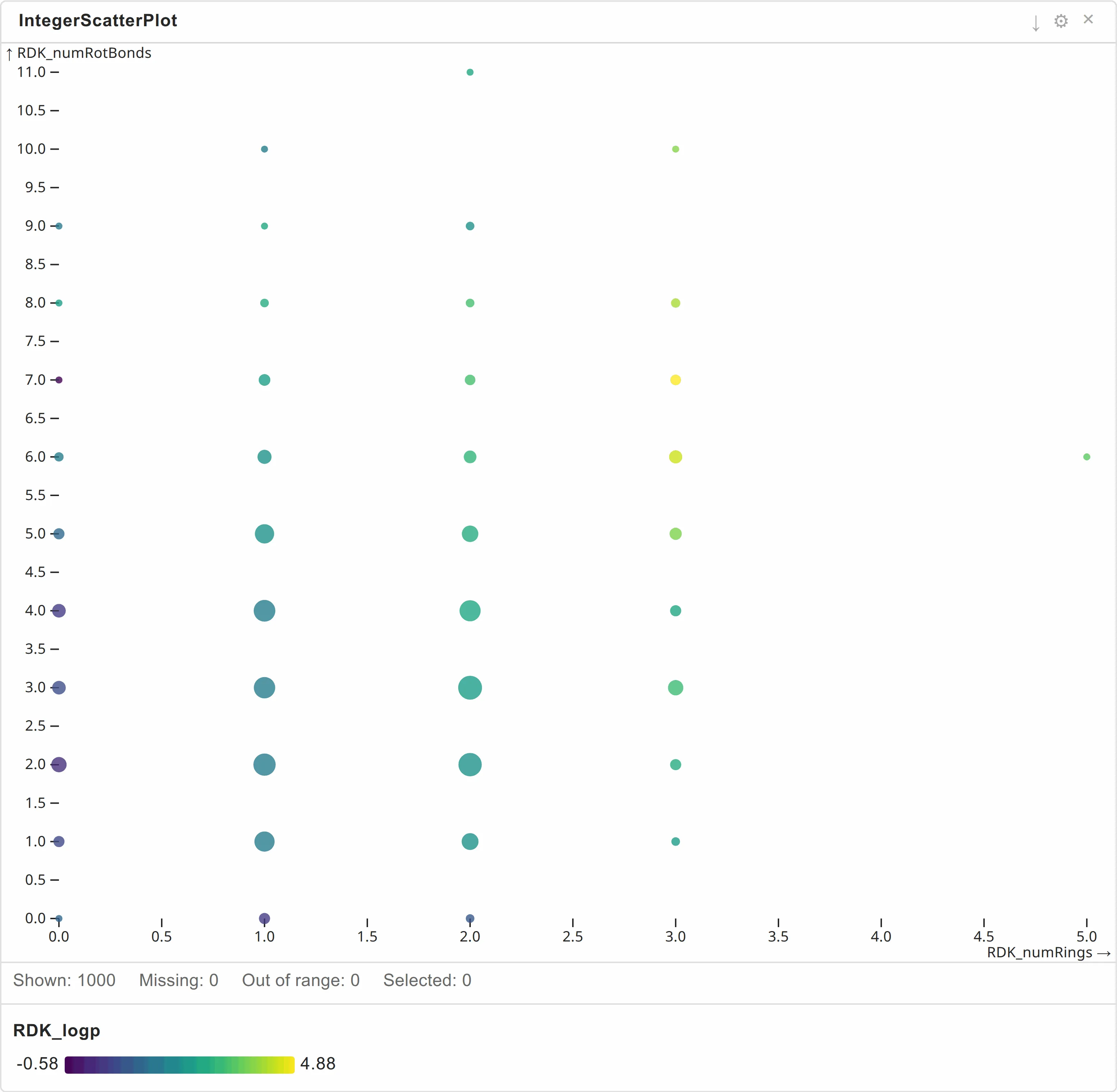
Fields: X axis*, Y axis*, Colour.
A flat panel: base colour, colour scale, aggregation, colour scale type and direction, then a minimum, maximum and direction for each axis.
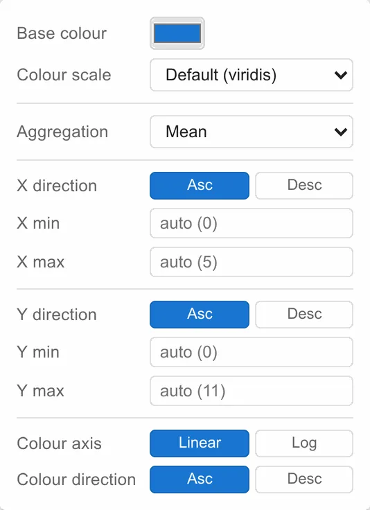
The axes deliberately have no Linear/Log toggle: counts routinely include zero, where a log scale has nothing to show.
Histogram
The distribution of one numeric field.
Fields: Field*, Colour.
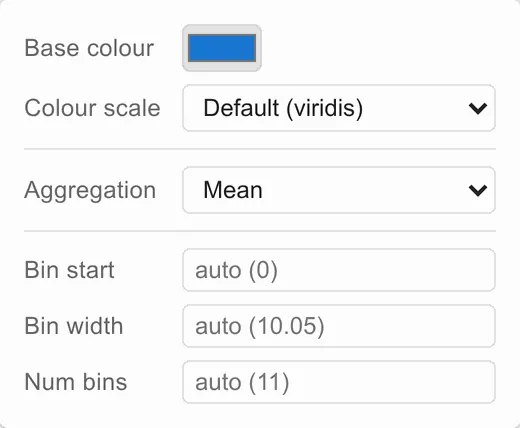
A flat panel: base colour, colour scale and aggregation, then Bin start, Bin step and Bin count. Leave them blank and the bins are worked out from the data; the placeholder tells you what that came to.
A histogram is the natural target for a marking connection: the whole distribution stays on screen and your selection is drawn against it, which is exactly the comparison you want.
ParallelCoords
One vertical axis per field, one line per row crossing them all — the way to see how several properties move together across a series, and where the trade-offs are.
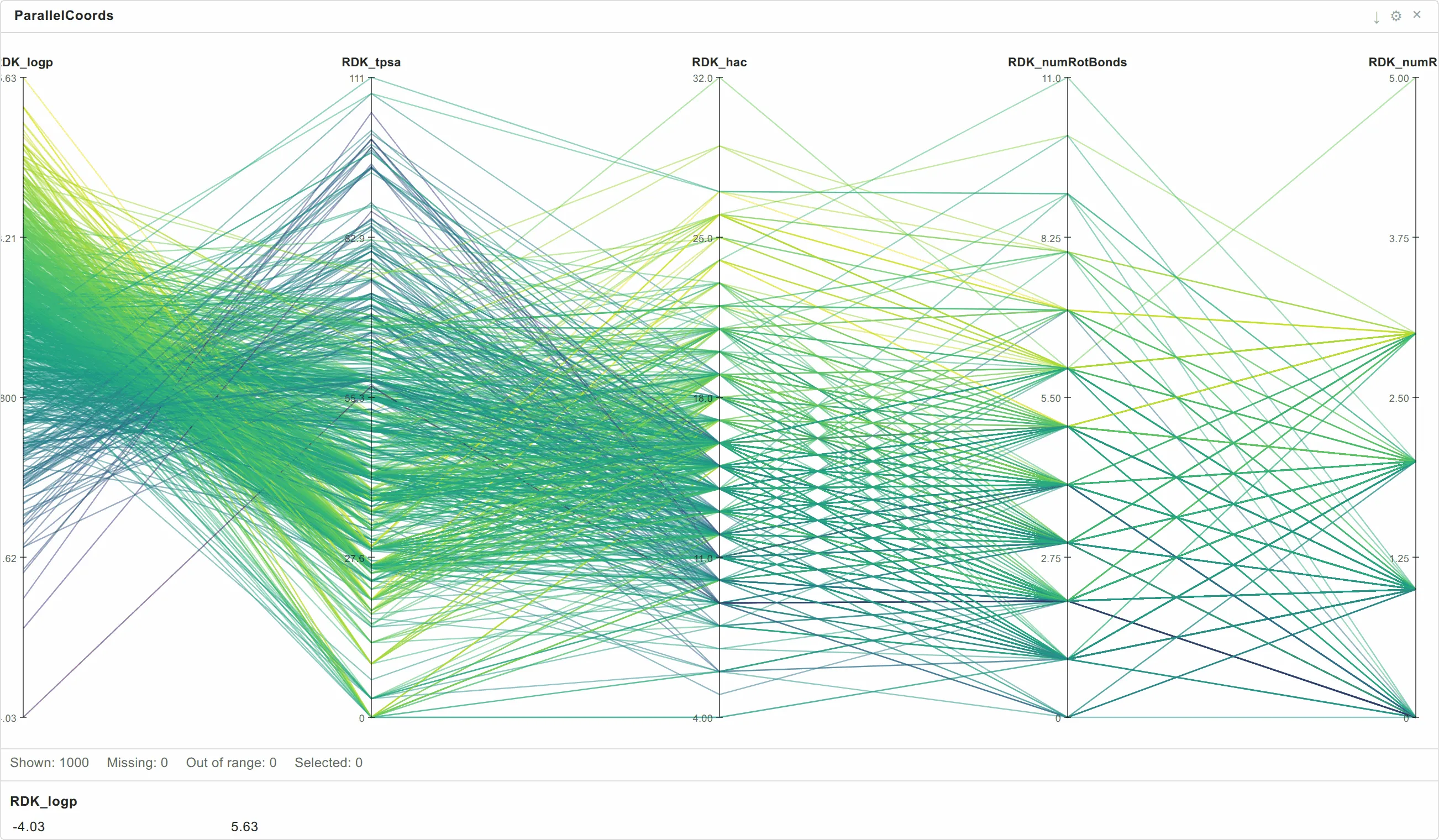
Fields: Fields* (two or more), Colour.
A flat panel: base colour, colour scale, aggregation, and the orientation of the axes.
BinnedBoxPlot
The distribution of one field within equal-width bins of another — median, quartiles, whiskers and outliers per bin. A scatter plot shows you every point; this shows you the shape of the trend.
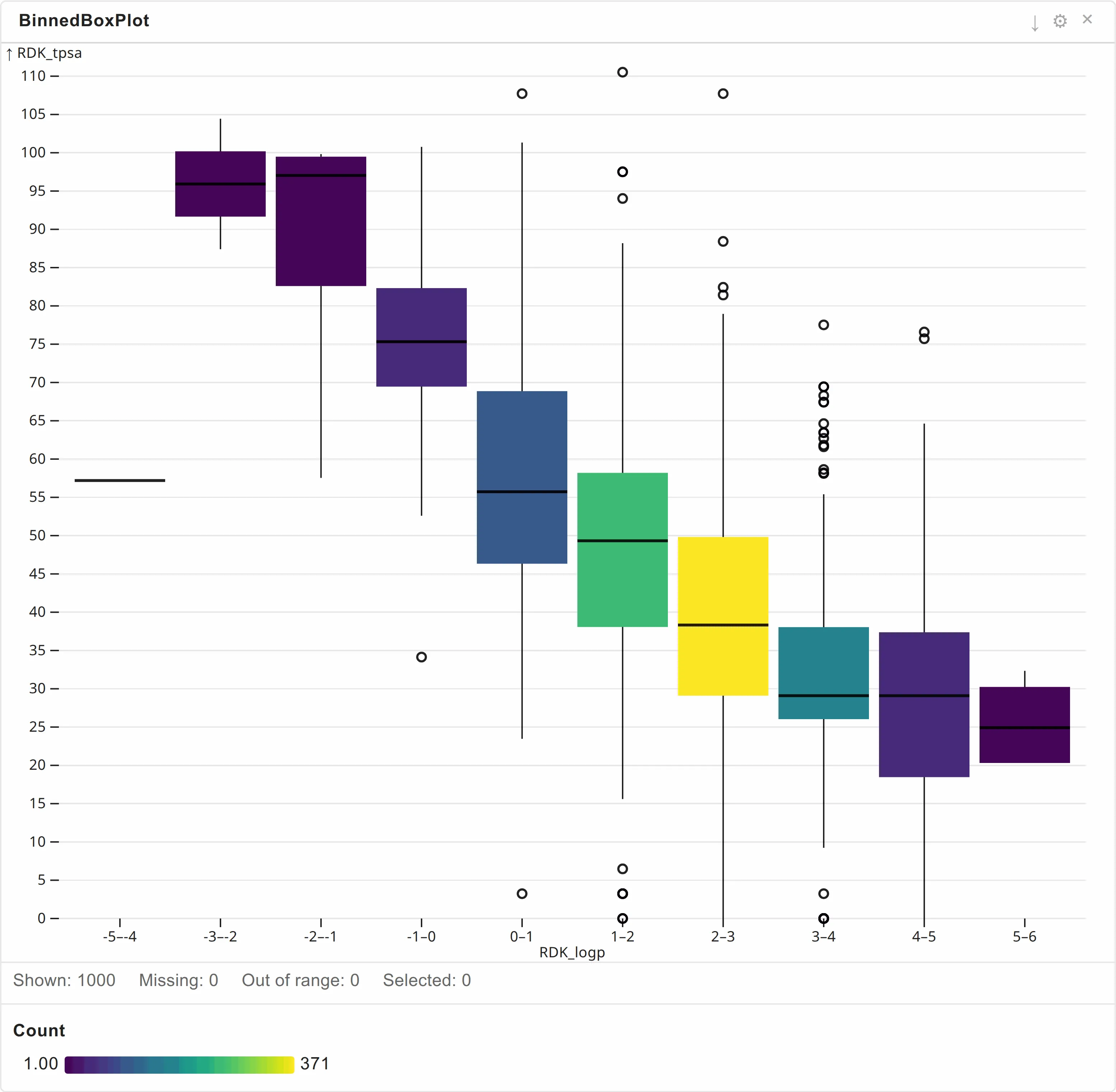
Fields: X axis* (binned), Y axis* (distribution), Colour.
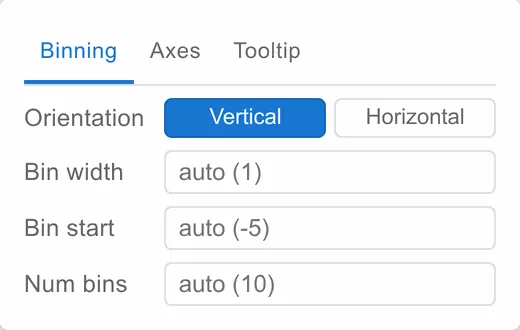
Binning | Axes | Tooltip
| Tab | Settings |
|---|---|
| Binning | Orientation, bin start, bin width, bin count |
| Axes | Distribution axis scale type and direction, minimum and maximum; base colour and colour scale, and the colour scale type and direction |
| Tooltip | The tooltip expression |
HexbinPlot
A density map. Points are gathered into hexagons and each hexagon is coloured by how many rows fell into it — or by an aggregate of a field across them.
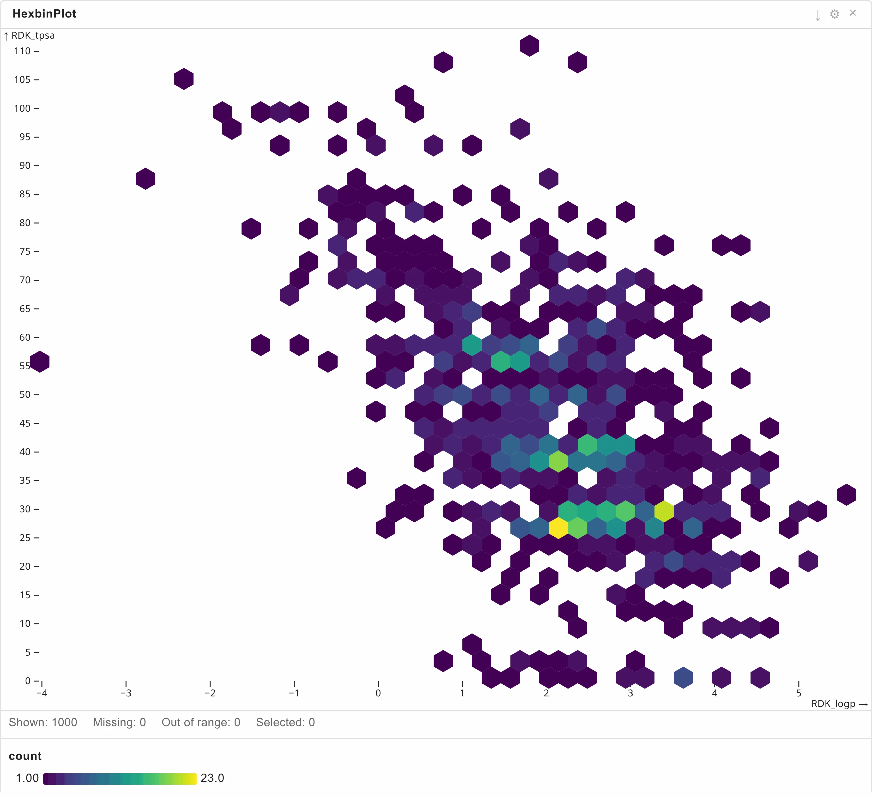
Fields: X field*, Y field*.
Axes | Appearance | Tooltip
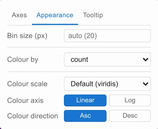
Colour by decides what a hexagon’s colour means: count, or the mean, sum or median of a field you then choose. Bin size (px) sets how coarse the grid is.
Use it when a scatter plot has too many points to read — tens of thousands of rows overplot into a solid blob, and a hexbin says where the mass actually is. It takes a filter but no marking: it draws bins, not rows.