Wiring patterns
Everything in this application is built from a handful of connections. These are the arrangements that come up again and again.
1. One chart filters another
Selecting in chart A leaves chart B showing only those rows.
Wire A’s selection output to B’s filter input. Both need the same
dataset on their dataset inputs.
This is the sharpest form of linking: what is not selected is gone. Use it when the point is to narrow down — a molecule grid that should only draw the compounds you picked, an interaction map that should only analyse a shortlist.
2. One chart marks another
Selecting in chart A leaves chart B showing everything, with those rows standing out.
Wire A’s selection to B’s marking instead.
The distribution stays on screen and your selection is drawn against it, which is the comparison you usually want from a histogram: where do the compounds I just picked sit in the whole set? A filter would throw away exactly the context that question needs.
Both can be live at once. A scatter plot’s selection can filter a molecule grid and mark a histogram from the same click — that is the arrangement in the screenshot on the home page.
3. Two charts driving each other
Either chart narrows the other.
Wire A selection → B filter, and B selection → A filter.
Useful for a pair of properties you keep cross-referencing. Be aware that it is easy to narrow yourself into an empty chart; clicking empty space clears a selection and gets you back.
4. A chart drives the 3D viewer
Pick compounds in a plot, see them in 3D inside the protein.
- Dataset → ScatterPlot
dataset, and Dataset → MoleculeViewer3Ddataset. - ScatterPlot
selection→ MoleculeViewer3Dfilter. - FileSelector holding the protein → MoleculeViewer3D
files.
Leave the viewer’s Require filter on: it stops the viewer loading every molecule in the file before you have said which ones matter.
5. Triage in the map, walk the set in the diagram, watch it in 3D
The full arrangement for docking output, and the one the molecular nodes exist for. Each stage narrows the last.
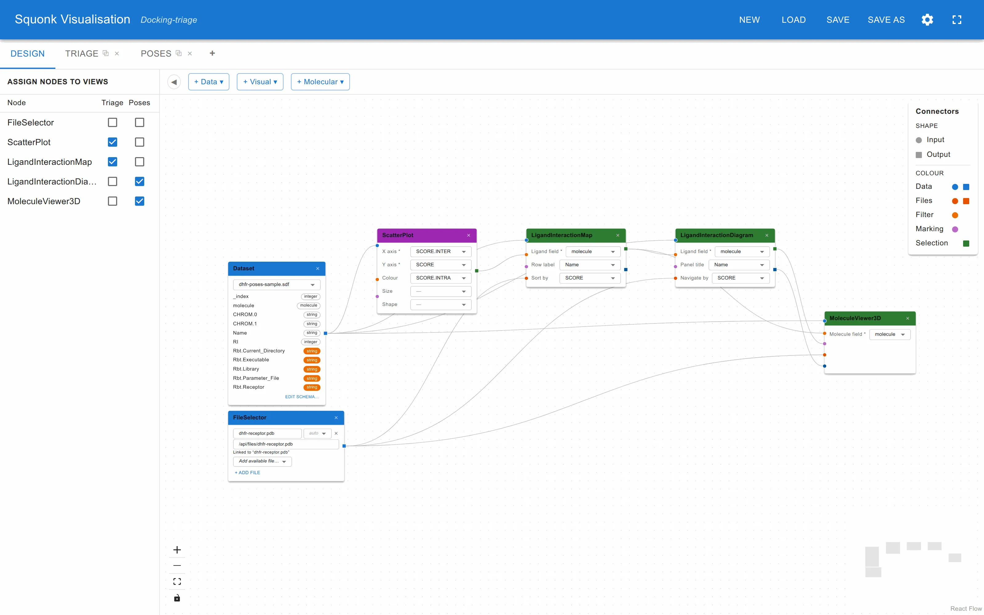
- Dataset (3D poses) → the
datasetinput of the scatter plot, the interaction map, the interaction diagram and the 3D viewer. - FileSelector (the receptor) → the
filesinput of the map, the diagram and the viewer. - ScatterPlot
selection→ LigandInteractionMapfilter. Scores in, a shortlist out. - LigandInteractionMap
selection→ LigandInteractionDiagramfilter, and → MoleculeViewer3Dfilter. - LigandInteractionDiagram
selection→ MoleculeViewer3Dmarking. - LigandInteractionDiagram
residues→ MoleculeViewer3DhighlightResidues.
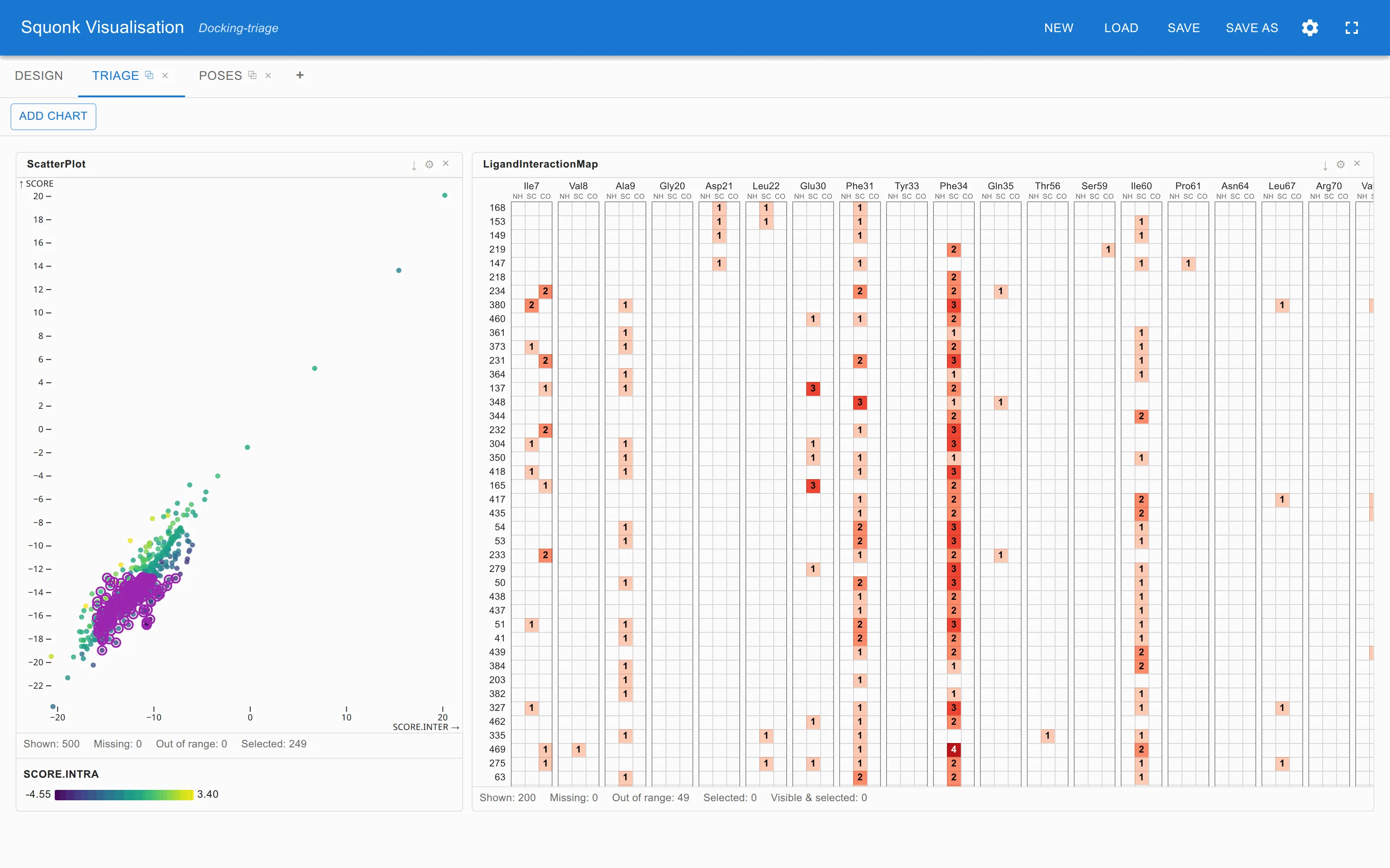
Then, in the views: box-select a promising region of the score plot, read off in the map which residues the shortlist shares, click a few ligand names to narrow it further, and step through those in the diagram. The 3D viewer shows the shortlist with the pose you are on picked out of it, and — with Show only highlighted residues on — only the part of the protein it touches.
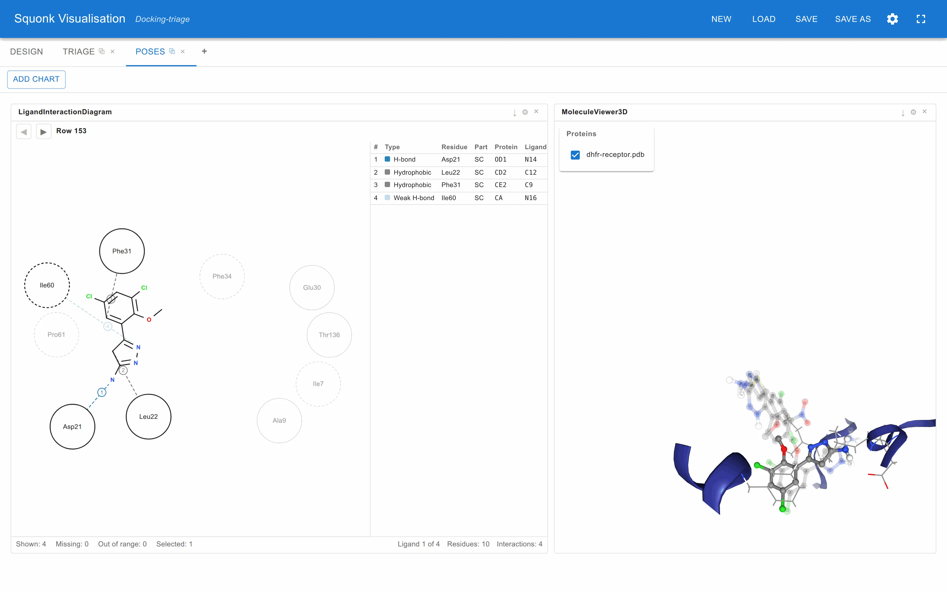
Step 5 is the one worth dwelling on. Sending the diagram’s selection to the viewer’s filter would show that pose alone; sending it to marking, with the shortlist on the filter, keeps the others on screen dimmed. Comparing a pose against its neighbours is usually the whole point.
6. Sketch to search
Draw a structure and use it to filter a molecule grid.
- Add a MoleculeSketcher and wire its
moleculeoutput to a MoleculeCardGrid’smoleculeinput. - In the grid’s ⚙, under Algorithm, choose Substructure or Similarity (with a threshold).
- Draw in the sketcher. The grid follows as you draw.
In substructure mode the hits are drawn oriented the way you sketched the query, with the matched part shaded — so the series lines up and the difference is what you see.
7. R-group decomposition
Lay a series out by what varies.
- Add a MoleculeSketcher and wire its
moleculeoutput to an RGroupTable’s Scaffold input. - Wire the Dataset to the table’s
datasetinput, and set the structure field, the label field and the cell fields on the node. - Draw the core in the sketcher with R-group attachment points.
- If the scaffold has three or more R-groups, choose which two form the axes in the table’s ⚙.
8. Calculated columns feeding everything downstream
Derive the quantity you actually want to plot.
Put a Calculated Fields node between the dataset and the charts, and every chart downstream offers the new columns.
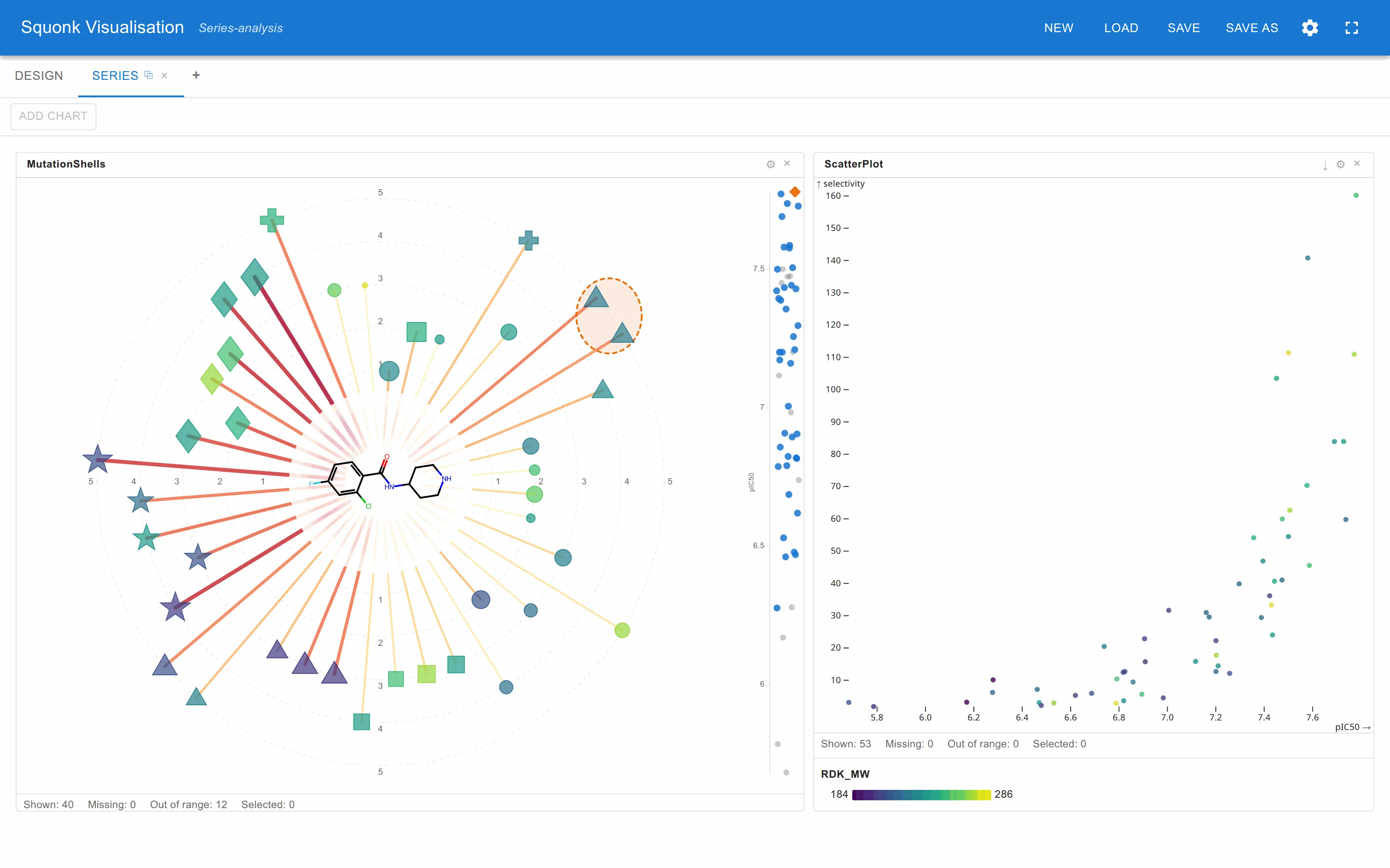
The chart above plots pIC50 against selectivity, neither of which is in the
file: one is -log10([IC50_nM_TargetA] / 1e9) and the other is
[IC50_nM_TargetB] / [IC50_nM_TargetA].
Calculated Fields nodes chain, and they work after a Data Joiner too — which is the point of it being its own node rather than a setting on the dataset. The transform adds columns and changes nothing else: same rows, same order, so selections and filters wired across it keep working.