The design tab
The Design tab is where you say what your visualisation is made of. You add nodes and draw connections between them; the View tabs then draw whichever nodes you assign to them.
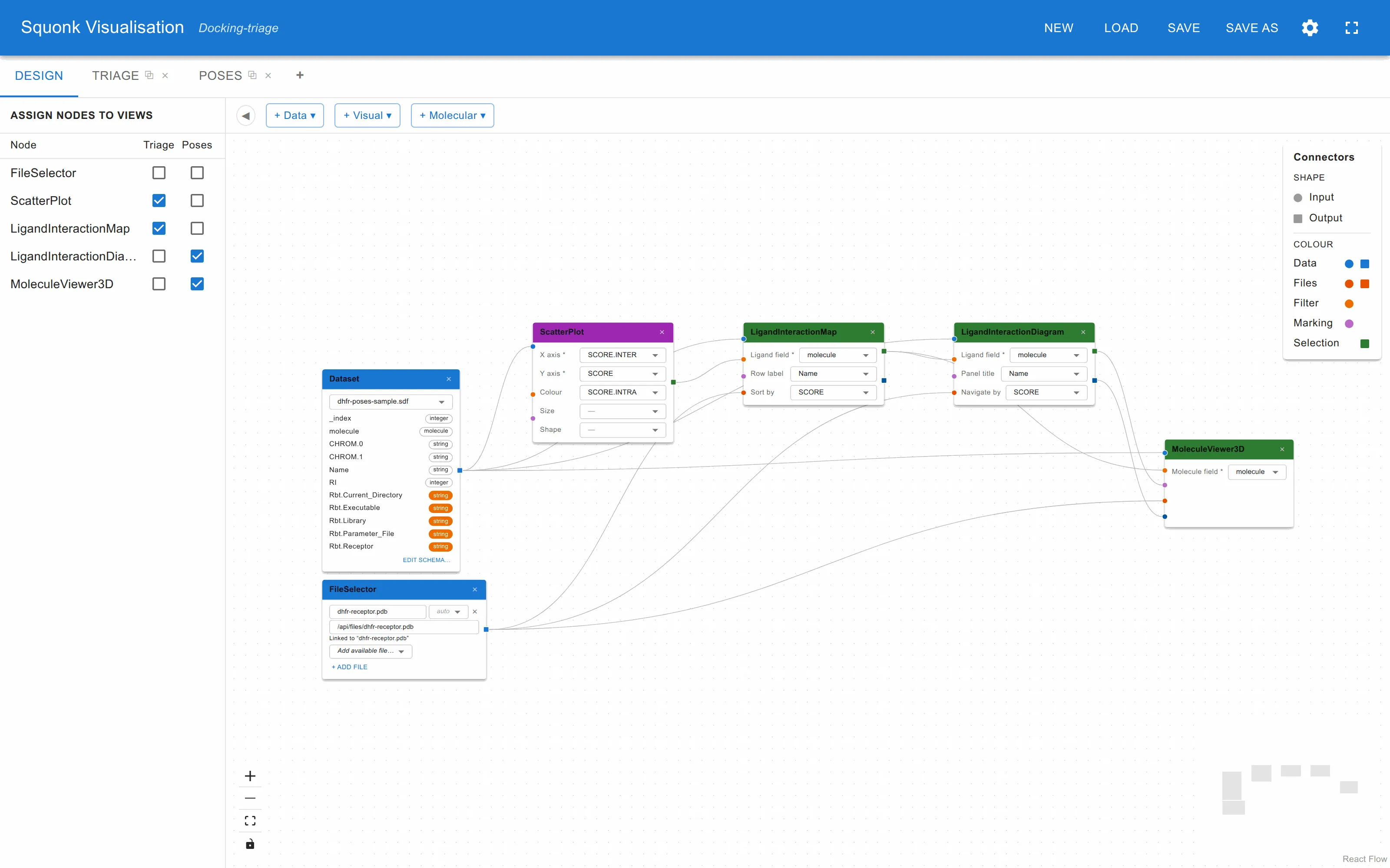
This page is about using the canvas. What each individual node does is in Components.
Adding nodes
Three menus in the toolbar add nodes. Click one and pick an entry: the node appears on the canvas immediately.
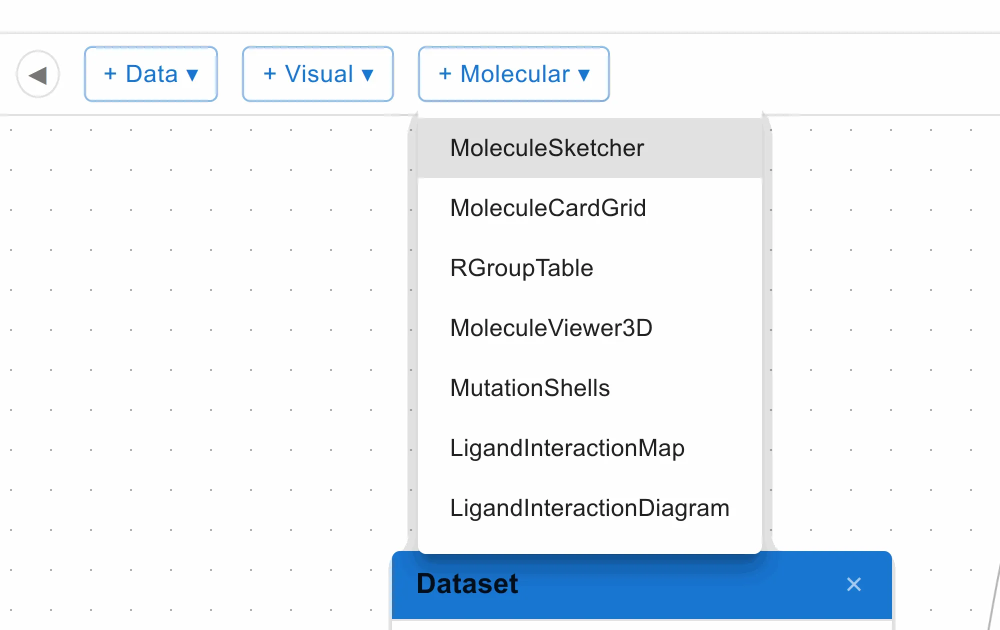
The three menus are the three families of component, and they are colour-coded on the canvas so you can see at a glance what a graph is made of:
| Menu | Title bar | What these nodes are |
|---|---|---|
| + Data | Blue | Where data comes from and how it is reshaped before anything draws it |
| + Visual | Purple | Charts — points, bars, boxes and densities |
| + Molecular | Green | Views that draw structures rather than points |
| Family | Components |
|---|---|
| Data | Dataset, Data Joiner, Calculated Fields, FileSelector |
| Visual | ScatterPlot, FacetScatterPlot, MultiFieldScatterPlot, IntegerScatterPlot, Histogram, ParallelCoords, BinnedBoxPlot, HexbinPlot |
| Molecular | MoleculeSketcher, MoleculeCardGrid, RGroupTable, MoleculeViewer3D, MutationShells, LigandInteractionMap, LigandInteractionDiagram |
Each is described under Components.
If exactly one Dataset node is on the canvas when you add a chart, the chart is wired to it for you.
Working with the canvas
Double-click a node’s title to rename it. The name is what identifies the node in the Add chart menu and in the node assignment grid, so a canvas of six charts is much easier to work with once they are called something other than ScatterPlot 2. It is also what a Data Joiner uses to disambiguate columns of the same name from two inputs.
Select a node and press Delete to remove it, along with every connection to
it. Click a connection to select it, then Delete, to remove just that one.
Drag the background to pan; scroll to zoom; the controls in the bottom-left corner zoom, fit everything into view, and lock the canvas against accidental dragging.
Fields live on the node
Every node that draws something carries its field choices on its face — which
column is the X axis, which holds the structures, which to colour by. A field
marked with a * is required, and until it is set the node’s panel shows a
message instead of a chart.
Each dropdown offers only fields of a type that makes sense, so a text column is never offered as an axis. Which fields a node asks for depends on what it draws, and is listed with each component.
Everything else about a chart — scales, ranges, binning, colours, tooltips — is set on the chart itself in a view tab, behind its ⚙. Fields here, appearance there. See Settings.
Connections
Ports on the left of a node are inputs, drawn as circles. Ports on the right are outputs, drawn as squares. Drag from an output to an input to connect them.
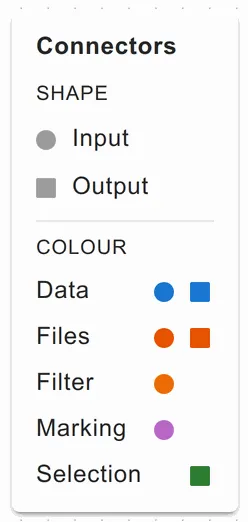
A connection can only be drawn between ports that fit, so an invalid one is simply refused as you drag.
| Port | Colour | Carries |
|---|---|---|
| dataset | Blue | A whole dataset, from a data node into anything that draws it |
| files | Dark orange | Structure files, from a FileSelector |
| filter | Orange | Row identifiers: rows not in the list are not drawn at all |
| marking | Light purple | Row identifiers: everything stays visible, but the marked rows stand out and the rest are dimmed |
| selection | Green | The rows currently selected in a chart — an output |
| molecule | Light blue | A structure drawn in a MoleculeSketcher |
| residues | Navy | The protein residues an interaction view found to be contacted |
Filter and marking are the two ways one chart can drive another, and the difference is the whole point. A filter removes the rest; a marking keeps the rest for context and picks your selection out of it. Both can be in use at once, on different charts, from the same selection.
The wiring patterns page works through the combinations worth knowing.
Assigning nodes to views
The panel on the left — toggled with the ◀ / ▶ button — is a grid of every chart node against every view tab. Tick a box to put that node in that view.
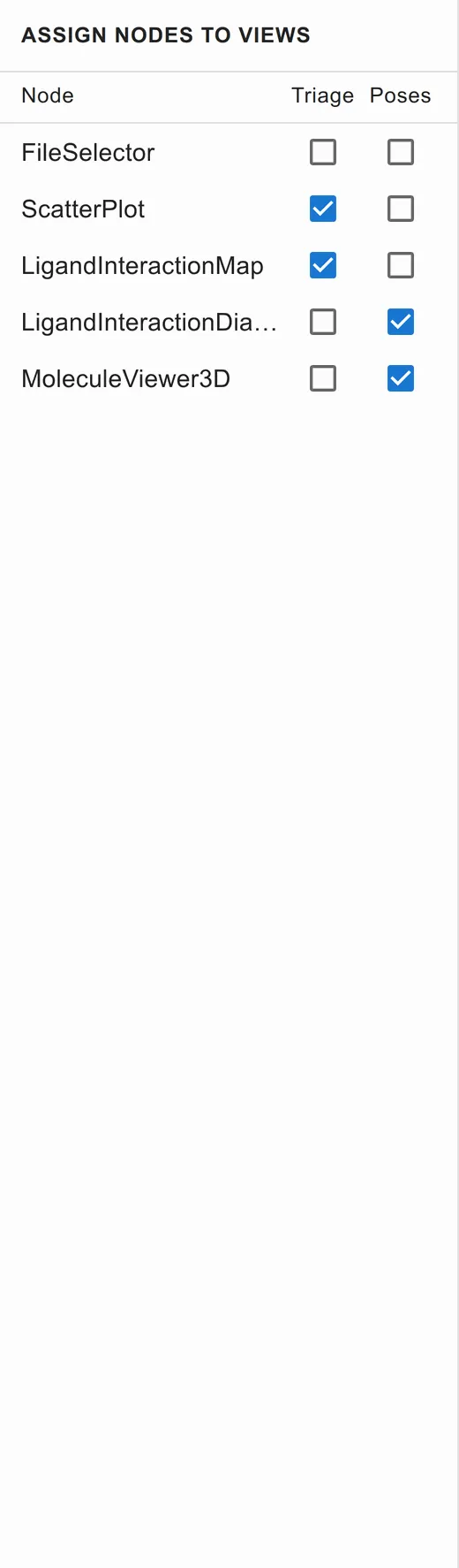
It does the same job as Add chart inside a view tab, but shows the whole picture at once, which is what you want when a node belongs in two views or when you are checking that nothing has been left out.